Welcome back to the weekly update and thank you again for stopping by. This week we are moving into the polish phase for much of Boss 101. This includes the UI and the overall gameplay.
Today’s focus is on the UI improvements we are making.
Backstory:
If you recall last week, I spoke about the types of work you have on a game, they are:
-What you know you’ve done
-What you know you haven’t done
-What you DON’T KNOW and you HAVE DONE
-What you don’t know and you haven’t done
Today’s topic is really about the third category because when it comes to polish there are likely many things you have already done that you don’t know about. This was not scheduled per-se but resulted from a lucky bit of earlier work. An example – you create the UI for an inventory panel a while back. When you go to make the UI for the player store you realize you already had done the base work when you did the player inventory. It was matter of re-using the designs and ideas to quickly make the new store in a fraction of the normal time.
This type of work must be recognized for what it is when the time comes or you will redo things unnecessarily. Recognizing work you ALREADY did is the way to avoid remaking things over and over.
We have two things on the list. The Boss 101 start screen and the hat store. Both of these had a very good first pass in the game. They were functional and you could do all the needed things with them. The problem was they were some of the first things done in the game. What that meant was they were the product of the oldest thinking and design styles. This isn’t a bad thing but we had some new things in that were pretty spiffy so when it came time to polish we had an opportunity to drop in some of the new stuff instead of trying to make the old art work.
The reasoning here is the old art was just not part of the same process and thinking as the latest (and near final) game. So here’s what we did!
Start Screen:
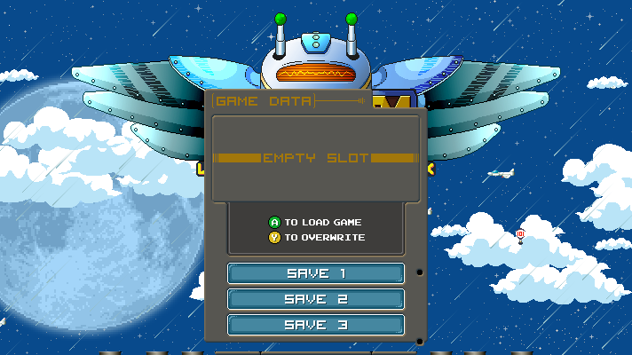
The old start screen with the first pass load game menu. Nothing exactly wrong with this, it functions but it is kinda lifeless and blocks the main menu. No bueno!
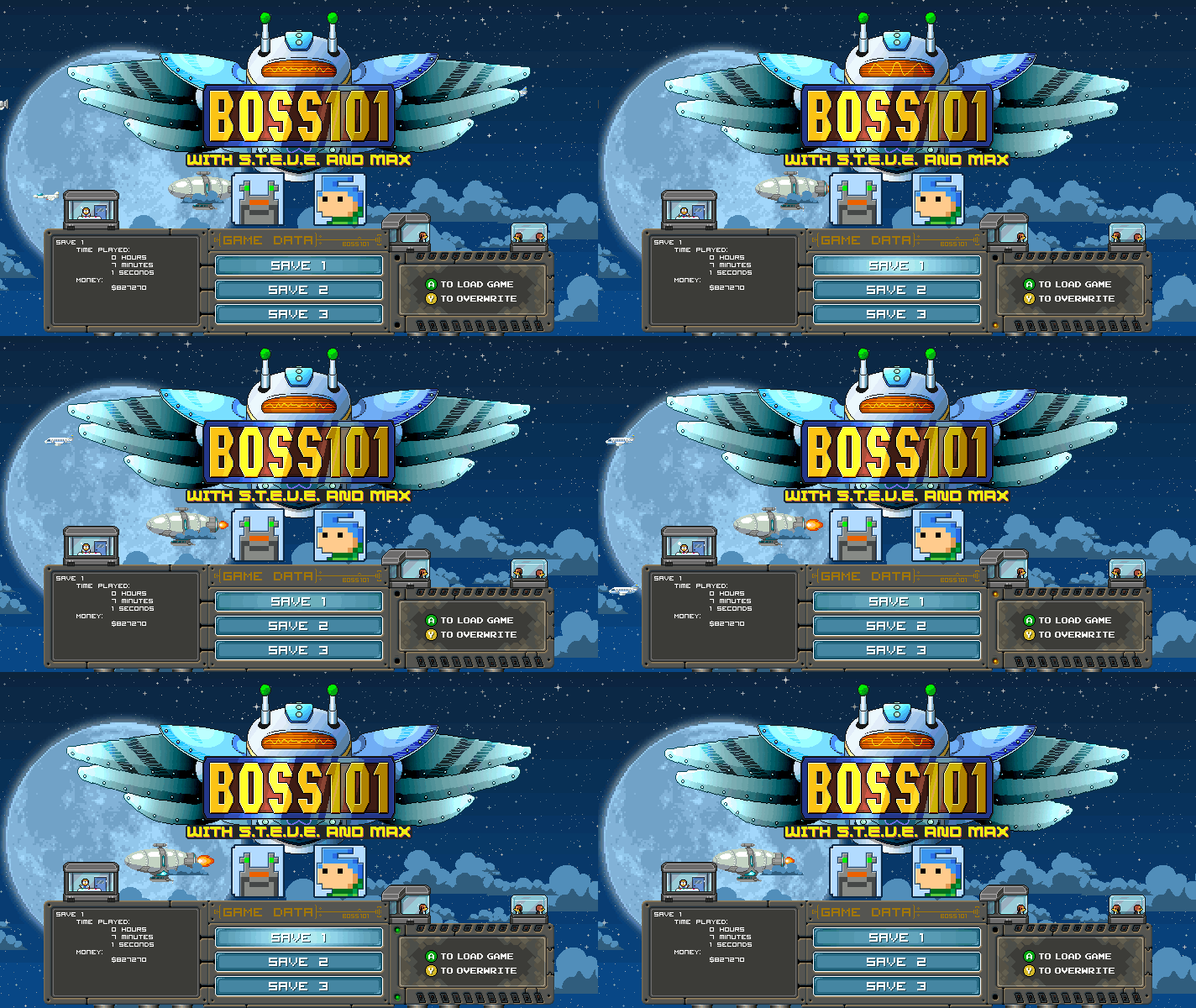
So we made some adjustments and added in the Gopher scientists you work with in the game. Notice the new animations and the way it shows off the main logo. MUCH BETTER!
Hat Store:
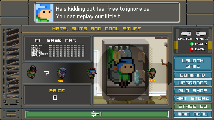
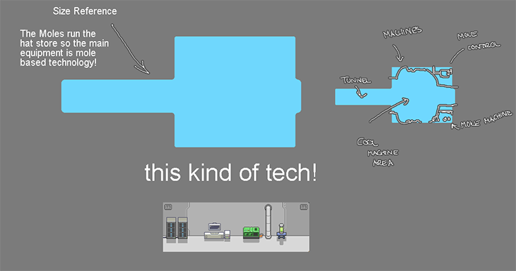
One of the oldest UI screens in the game. Developed early with a lot of high hopes. Thing is. It is not really thematically linked to any of the new Command Center art. Mister Gopher to the rescue again! The thinking here is you have a large command center and it’s story is part of the game. Why things look a certain way is writing into the main story. The old hat store didn’t fit that mythos but the new one does in a way the player will be a part of. Here’s a place where we have done some work and unified many things under one umbrella of logic. We simply added the hat store to that list
Old Hat Store
New Hat Store prep work
New Hat Store
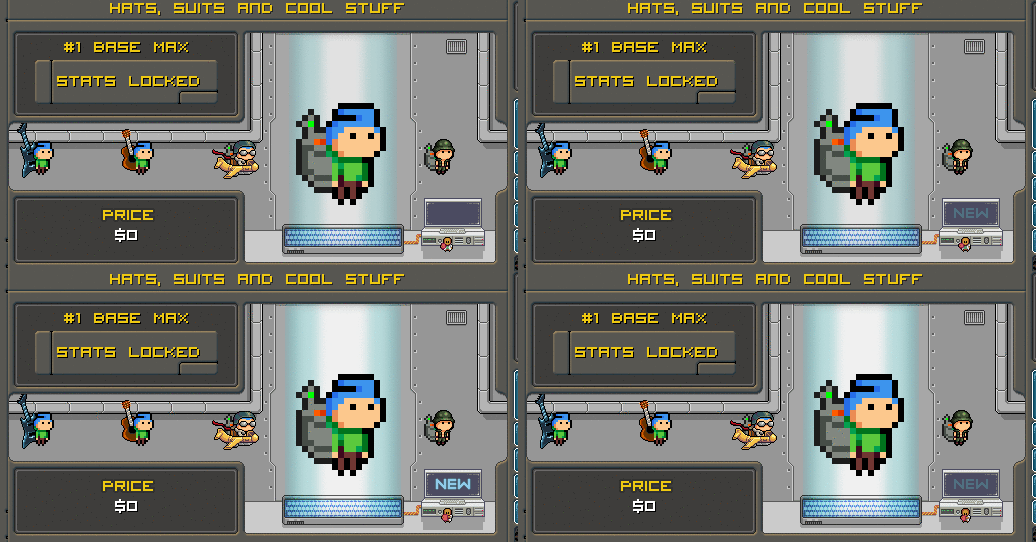
Minion Styled Hats
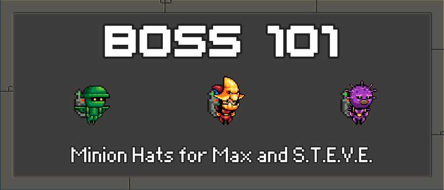
You can wear minion hats and maybe make some friends!
Ok - folks - that is it for this week but check back again.
As always - LIVE YOUR DREAMS!
-Tim
Wiesi
There is one thing I always wanted to ask you: Which prog do you use to make the Animated GIFs you're posting in here? Thanks!
DarkTimmy
You might not believe this but I use Photoshop. It is hands down the best too for any of this kind of nonsense. I capture the gameplay as video and get this - Photoshop can load the video directly! I even get a little time line I can do edits on. Super easy then I export the final product. I can also determine the size of the final product really easily with the export tool they use.