Welcome to the latest Boss 101 update. Thank you for stopping by and we appreciate your support.
Today we are going to talk about UI polish and ways we are improving the look of the game WHILE adding needed functionality.
The Arcade Machine!
In our Command Center (your main hangout) we have a bunch of nifty tools for you to play with. One of them is the AWESOME arcade machine where you can test your skills at old timey arcade games. The exact nature and type of those arcade games are for another post but what we will talk about is the arcade machine UI.
1. What we Had
We started with a flip down console which we LOVED. This was early in development and at the time it made a ton of sense. The thing here was the flipping down action looked cool to us and had a great feel. Sure – the actual game screen was a little small but WHO CARES!?!!? COOL FLIPPING ACTION! Right?
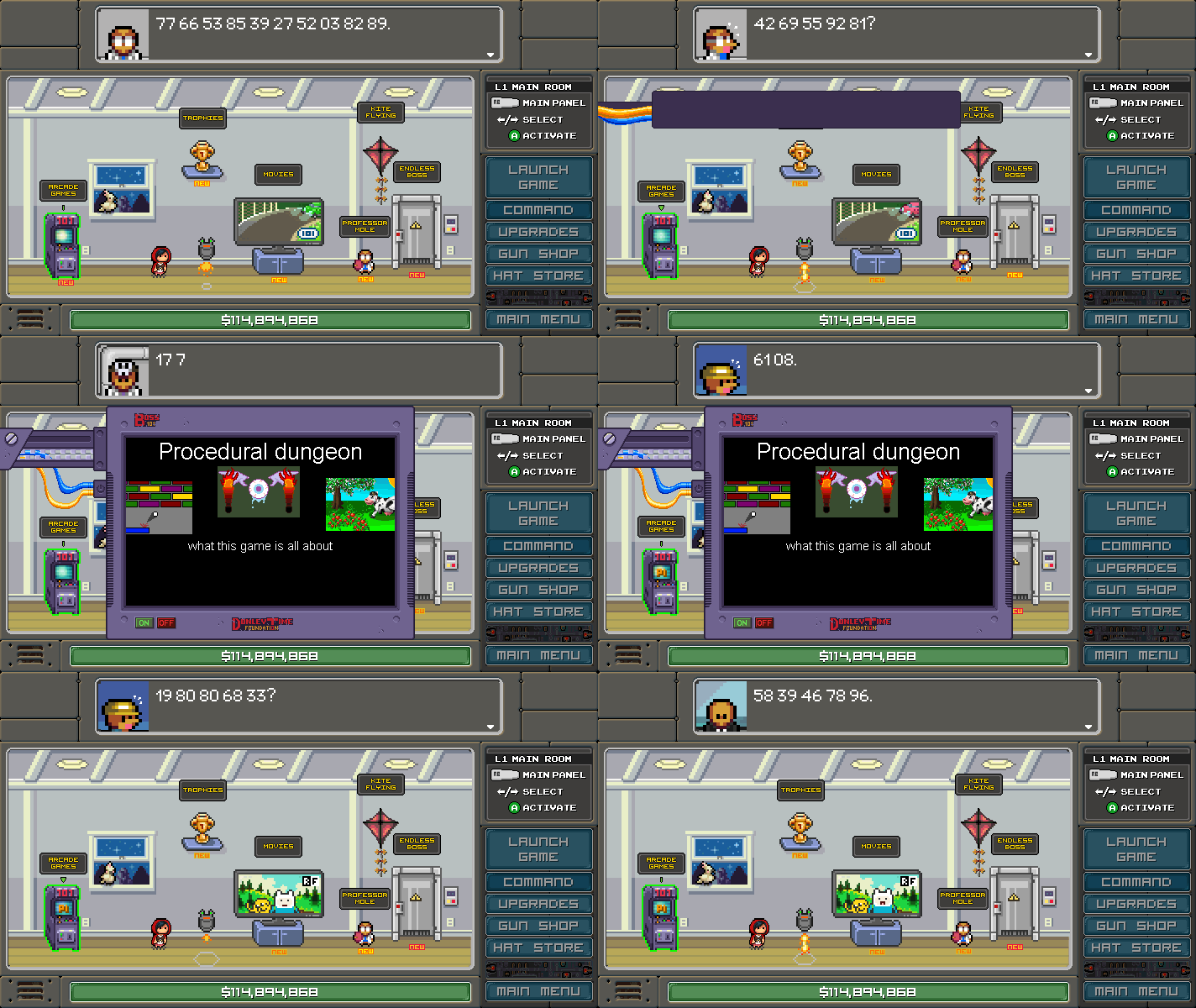
Well, it turns out it does matter how big the screen is. This plus the added complication of the arcade machine was being drawn to the game screen (we won’t bother you with programming backstory) made the flip down arcade action a lot less efficient than we first thought.
2. What we needed
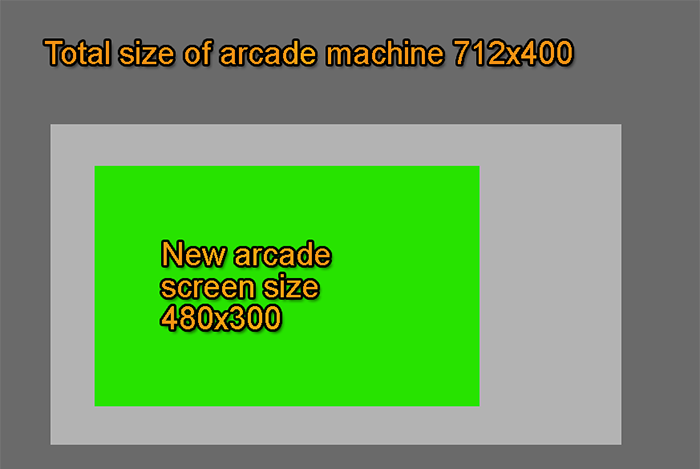
The arcade room was to be split off and brought into its own “room” in GameMaker. This would give us more space to display the game screen (good) and a chance to add more details to the arcade machine façade (also good). First thing on the list was hogging out the rough dimensions and getting a first pass concept.
3. First Pass
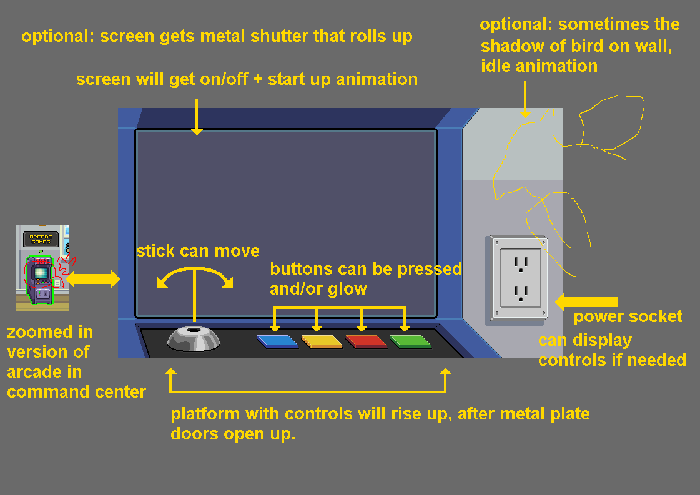
Here is a really nice pass at the arcade machine room. It’s a pulled in look at the wall space the arcade machine is on. Nothing wrong with it overall and it does have a certain echo of the actual room. Looking at it though, it wasn’t quite grabbing the vibe we had going in other areas of the game. Also – to REALLY do justice to something like this we felt there was a bunch of additional work to really make it shine (like make the buttons press along with the player controls and wiggle the joystick along with the player movements). The added workload didn’t have the bang for the buck we were looking for in this area of the game so we went back and made notes.
4. Notes
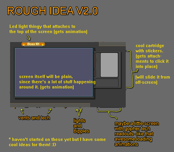
Taking what we had in other room we made notes about possible directions. Note that these are ON TOP of the first pass artwork.
5. Second Pass
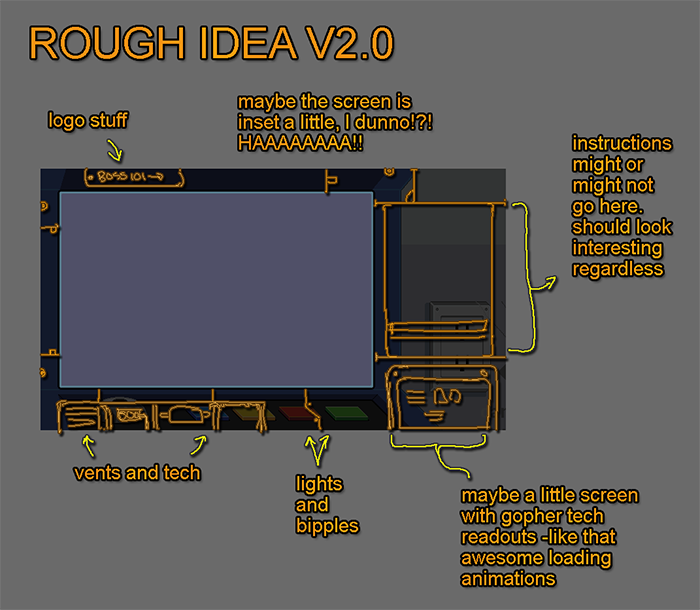
OK – now THIS is more like it. You can see we are using many design echoes from other screens and rooms in the game. Makes a big difference in the look of the room and also makes the whole thing fit thematically a little better. Also we can add some simple idles and change up things like the decals on the side for various games. A very nice pass indeed!
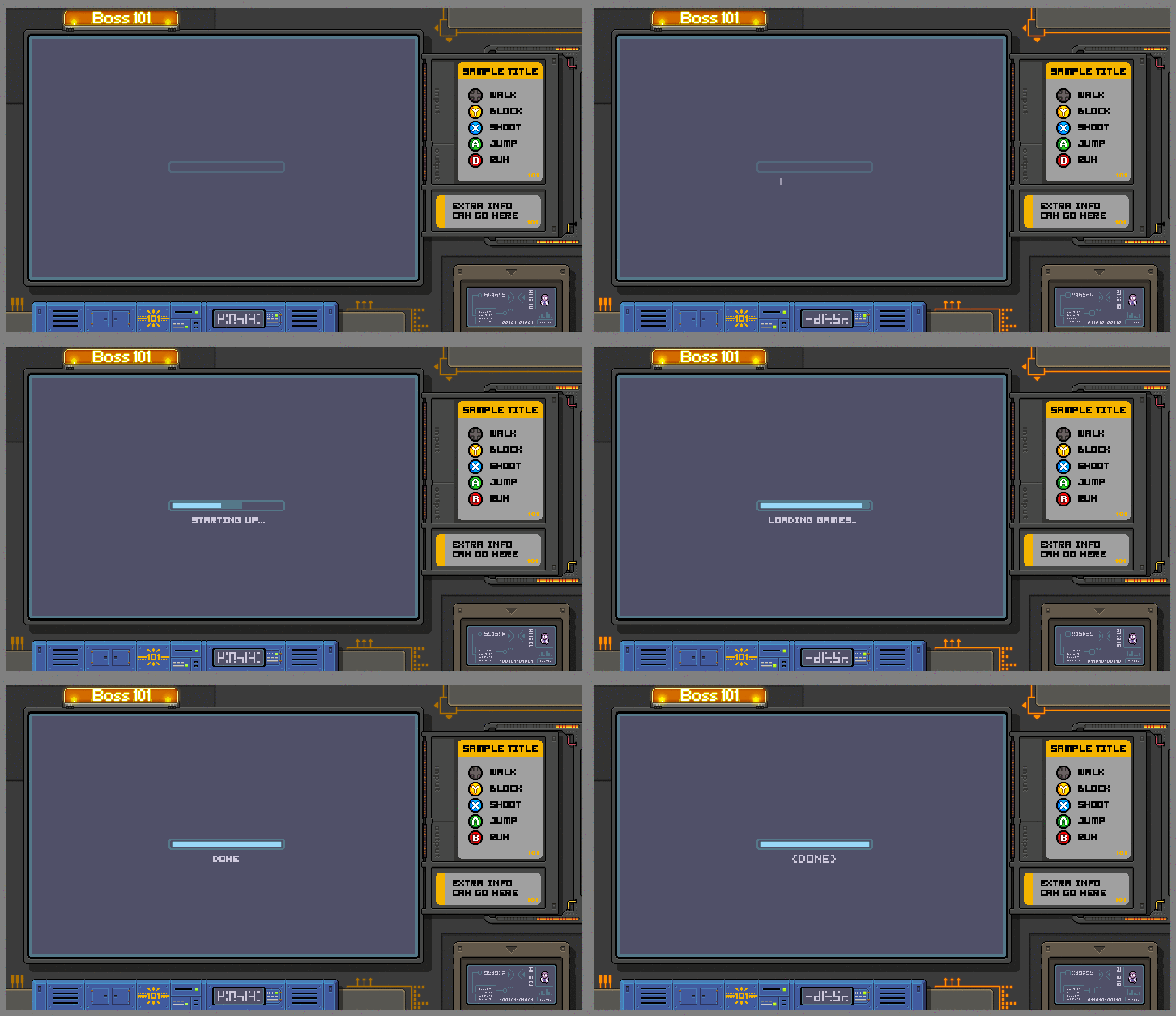
6. Sample with New art
This is dope – need I say more? See for yourself! Animations, cool style and a lot of potential as we add games to the arcade machine. We can now change up stickers and add decals as well as instruction sheets. MUCH BETTER.
Hope you enjoyed this look at some of our design process. Ideally this inspires you to keep on keeping on and make YOUR game as awesome you possibly can.
Also please remember to LIVE YOUR DREAMS!
-Tim
Check out our social links and track us on our Steam Store page for the latest info. THANK YOU!
stunkel
Looking great Tim!
DarkTimmy
@stunkel - Thank you so much! Appreciate the comment and the look!
-Tim